Slopegraph (pt. 1)
The Inspiration
For this exercise we’re creating a “slopegraph,” taking inspiration from the Top Languages Over Time chart at Github’s State of the Octoverse page (which, by the way, contains a wealth of other data-nerd goodies).
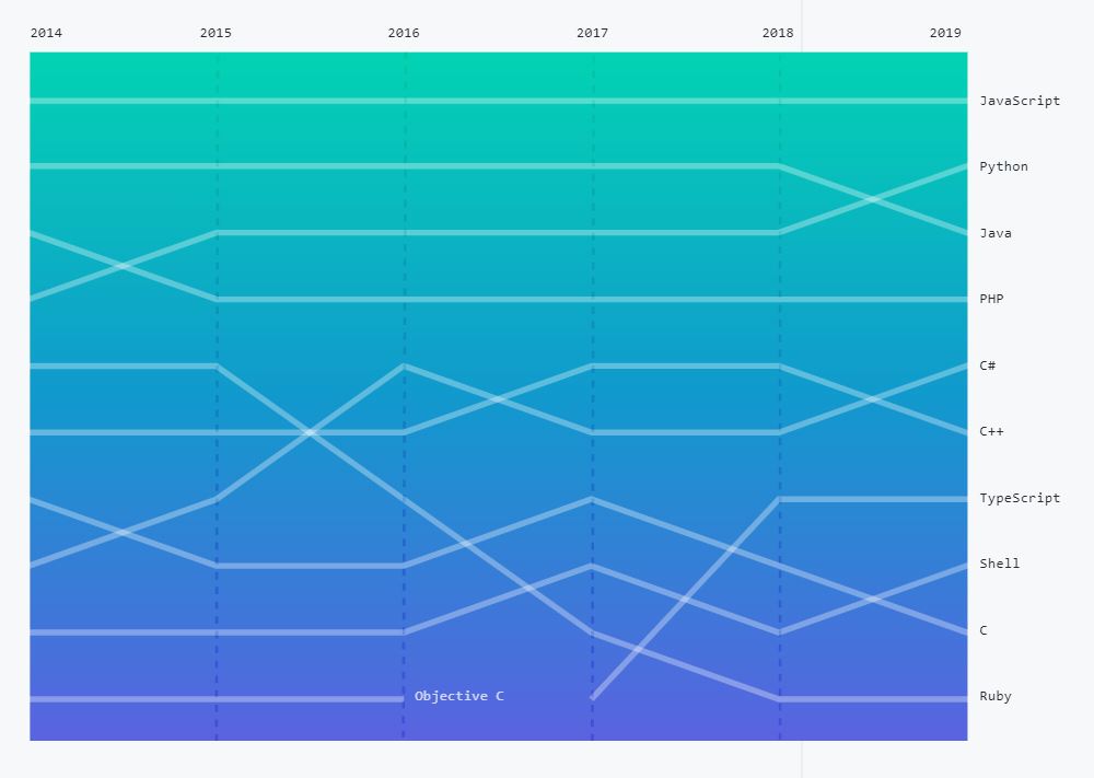
The idea with slopegraphs is that it allows you to elegantly depict changes in order or rank over time. It’s easy to see, in this example, that JavaScript has consistently been the most popular language on Github, and conversely that Objective C has struggled to stay in the top 10. Charlie Park’s Slopegraphs page has more information than you could ever want about the form.
One feature you may notice in the Github chart is that the labelling is not completely consistent. All of the lines that appear in the latest Top 10 list are labelled along the right edge of the chart, but Objective C’s line, which ends prematurely, had to be labelled right smack dab in the middle of everything.
The Exercise
Using the baby name dataset, create a slopegraph with labels at the ends of each line.
The challenge here is to place the line labels at the right spot along the line - which would be either where the name’s rank last appears in the top 10, or where the end of the graph’s X-axis is reached. This feature is what makes this exercise more interesting than a straightforward multi-line graph.
A Solution
My solution is shown below.
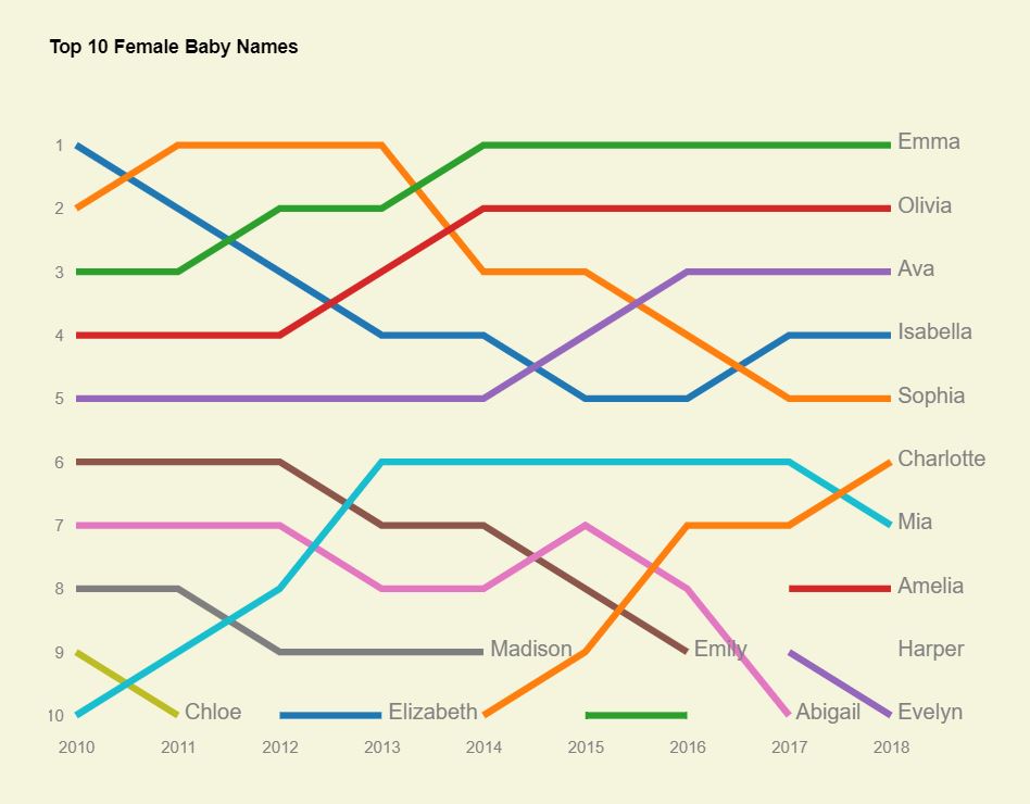
You may notice there is a short line at the bottom, then a missing data point in the latest year, for Harper. That’s because Harper fell out of the top 10 in 2017, then made a comeback. So there’s no real line to draw between 2016 and 2018, just a single point. Fixing this will be a separate exercise. (There’s another annoyance I have with this code, looking back, from a stylistic point of view, and that gets fixed too in the next iteration. See if you can guess what it is once you’ve looked over my solution.)
Here’s how I solved this exercise (as usual, I encourage you to attempt it first without peeking). The complete HTML/CSS/JS code and working example are on codepen.
// set margins by convention
const margin = {top: 50, right: 80, bottom: 30, left: 20},
      width = 700 - margin.left - margin.right,
      height = 500 - margin.top - margin.bottom;

// use separate svg and chart group to make it easier to add axes and labels and such
var svg = d3.select(".chart")
  .append("svg")
  .attr("width", width + margin.left + margin.right)
  .attr("height", height + margin.top + margin.bottom);

var chart = svg
  .append("g")
  .attr('transform', `translate(${margin.left}, ${margin.top})`);

// set the ranges
var x = d3.scaleLinear().range([0, width]);
var y = d3.scaleLinear()
  .domain([1, 10])
  .range([0, height]);

function createChart(rawData) {

  // munge data
  let names = d3.keys(rawData[0]).filter(d => d !== "Year");
  let data = names.map(name => {
    let arr = rawData.map(d => ({Year: d.Year, Rank: d[name]}));
    return {Name: name, Data: arr};
  })

  // x scale
  x.domain(d3.extent(rawData, d => d.Year));

  // colors
  const colors = d3.scaleOrdinal(d3.schemeCategory10)
    .domain(names);

  var valueline = d3.line()
    .defined(d => d.Rank <= 10)
    .x(d => x(d.Year))
    .y(d => y(d.Rank));

  // Add the paths.
  data.forEach(name => {
    chart.append("path")
      .attr("class", "line")
      .attr("d", valueline(name.Data))
      .attr("stroke", colors(name.Name));
  });

  // create labels and add to the end of each line

  function findLineEnding(data) {
    // return the point where the line ends
    for (let i = data.length - 1; i >= 0; i-- ) {
      if (data[i].Rank <= 10) return data[i];
    }
  }

  let labelPositions = data.map(el => {
    let lineEndingObj = findLineEnding(el.Data);
    return {
      Name: el.Name,
      ...lineEndingObj
    }
  });

  var labels = svg
    .append("g")
    .attr('transform', `translate(${margin.left}, ${margin.top})`);

  labels.selectAll("text")
    .data(labelPositions)
    .join("text")
      .attr("x", d => x(d.Year))
      .attr("y", d => y(d.Rank))
      .attr("dy", "3px")
      .attr("dx", "5px")
      .text(d => d.Name);

  // Add axes
  let yAxis = d3.axisLeft(y);

  svg.append("g")
    .attr('transform', `translate(${margin.left}, ${margin.top})`)
    .call(yAxis);

  let xAxis = d3.axisBottom(x)
    .tickFormat(d3.format(".0f"));

  svg.append("g")
    .attr('transform', `translate(${margin.left}, ${margin.top + height + 10})`)
    .call(xAxis);
 }

d3.csv( "https://gist.githubusercontent.com/fraziern/6ca21ed36b217894901256aeab822f00/raw/b00b79f03314505c96403cd7b34475c694c124bf/popular_names_ssa.csv", d3.autoType)
  .then(createChart);
And check out Slopegraph part 2, where we try to improve on the results of this exercise.