Displaying Distributions
Most of the exercises on d3aday were inspired by complete data visualizations. This one was somewhat inspired by a particular look and feel, but was mostly inspired by the data itself. Along the way, though, you can stay sharp on your data munging and formatting skills, and create an interesting graph with some Covid-19 related data.
The Inspiration
The inspiration for this exercise comes from the New York Times and Dynata’s July 2020 survey on public mask-wearing. They published data for counties across the U.S. that answered the question, “How often do you wear a mask in public when you expect to be within six feet of another person?” The Times’s analysis of this data is fascinating and quite beautiful in its own right.
The data can be found in full here.
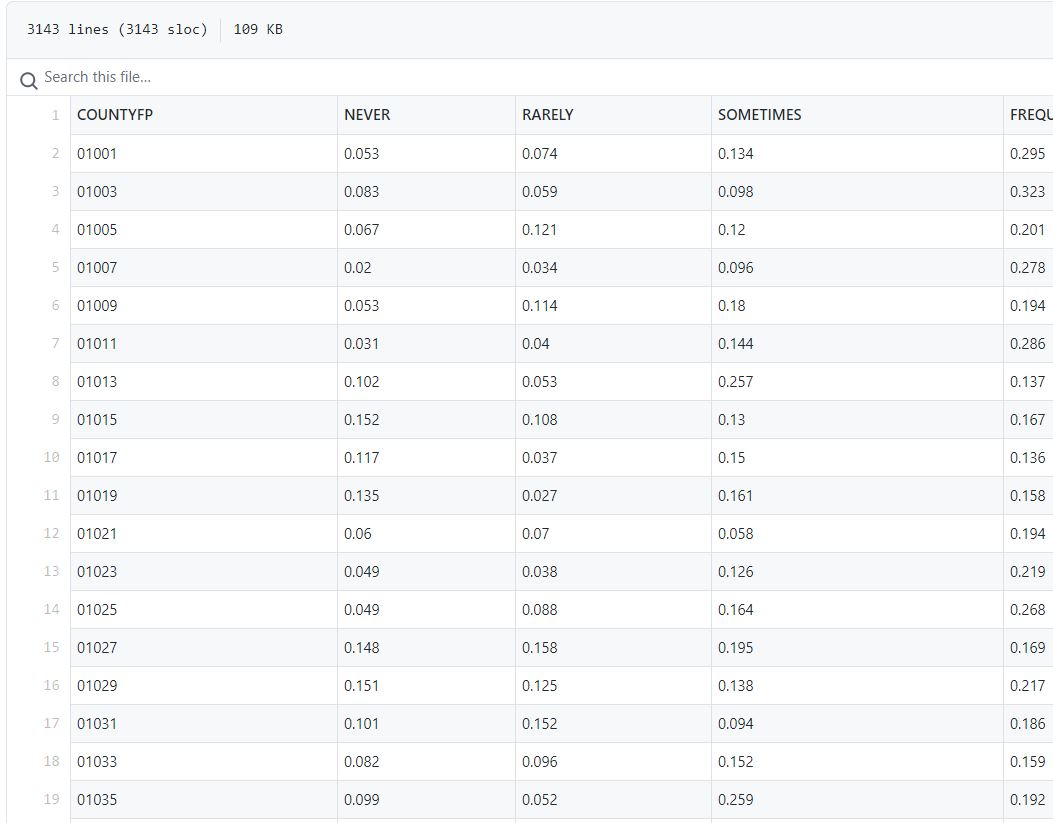
We took a piece of the data - respondents who say they “always” wear a mask in public - and set out to use it to create a graph that compared different states. You can find our streamlined csv (with state designations added) here.
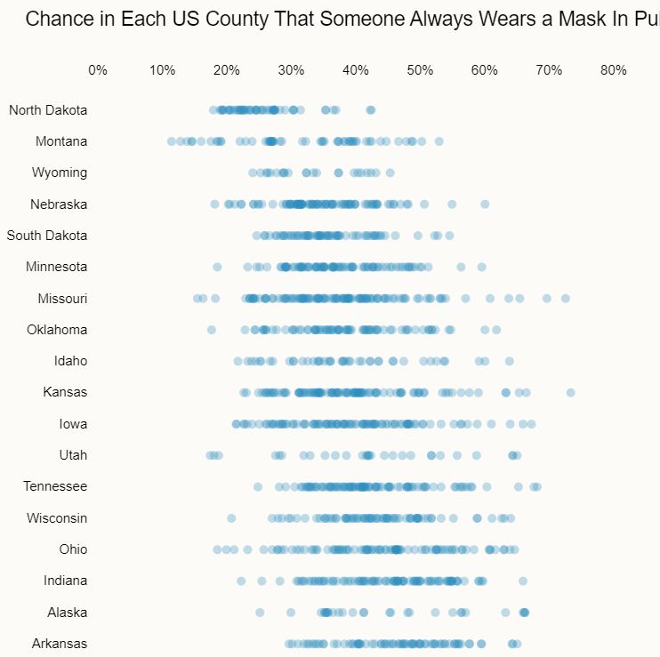
The visual inspiration
This “dot graph,” also known as a dot strip graph or strip graph, is a way to visualize data points for different categories in a compact form. The emphasis here is on the distribution of the points across the horizontal - you can easily see how clumped together or spread out they are in each row.
We wanted to recreate this look in showing how varied the mask survey results are for each state.
The Exercise
For our version of this viz, we wanted to keep things pretty standard. Each state gets a row, and each row shows the percentage responses for that state’s data as circles.
The X-axis should be a range from 0% to 100%.
We also wanted to sort the states in order of average percentage, rather than something arbitrary like alphabetical. That will make it easier to see where each state ranks overall in mask usage.
The data can be found here.
One hint - I found it easier to sort things by creating an object for each state, adding the average to the object, then sorting all the objects in an array. Something like this:
d3.csv(URL, d => d3.autoType(d))
  .then(d => groupbystate(d))
  .then(d => maptoobject(d))
  .then(d => d.sort((a, b) => a.avg - b.avg))
  .then(createChart);
I’ll leave it up to the reader to write the groupbystate and maptoobject functions. Or you can just scroll down a little.
A Solution
My solution looks like this:
The solution code is below, but as always you’re encouraged to try writing it yourself before peeking. The complete code (with HTML and CSS) is available on codepen.
// Initial setup / set margins by convention
const margin = {top: 50, right: 30, bottom: 20, left: 90},
    width = 700 - margin.left - margin.right,
    height = 1500 - margin.top - margin.bottom,
    svg = d3.select(".chart")
      .append("svg")
        .attr("width", width + margin.left + margin.right)
        .attr("height", height + margin.top + margin.bottom);

var chart = svg.append("g")
  .attr('transform', `translate(${margin.left}, ${margin.top})`);

const URL = "https://gist.githubusercontent.com/fraziern/2d8425e0d205de3729e6dc9049a8914d/raw/2c27c55fa50a9935049fc2d85494f18c05490f09/always-mask-county-state.csv";

function createChart(data) {

  var x = d3.scaleLinear()
    .domain([0, 1])
    .range([0, width]);

  var y = d3.scaleBand()
    .domain(data.map(d => d.statename))
    .range([0, height])
    .padding(0.6);

  chart.append("g")
    .selectAll("g")
    .data(data)
    .join("g")
    .selectAll("circle")
    .data(d => d.data)
    .join("circle")
      .attr("cy", d => y(d.statename) + y.bandwidth() / 2)
      .attr("cx", d => x(d.always))
      .attr("r", 4)

  // y axis
  yAxis = g => g
    .call(d3.axisLeft(y));

  chart.append("g")
      .call(yAxis);

  // x axis
  xAxis = g => g.call(d3.axisTop(x)
      .tickFormat(d3.format(".0%")));

  chart.append("g")
      .call(xAxis);
}

function groupbystate(d) {
  return d3.groups(d, d => d.statename);
}

function maptoobject(d) {
  return d.map(d => ({
    statename: d[0],
    data: d[1],
    avg: d3.mean(d[1], d => d.always)
  }));
}

d3.csv(URL, d => d3.autoType(d))
  .then(d => groupbystate(d))
  .then(d => maptoobject(d))
  .then(d => d.sort((a, b) => a.avg - b.avg))
  .then(createChart);