Adding a Tooltip To A Chart
Unlike most of the exercises thus far, the focus of this exercise is not on binding data to objects or drawing data to the screen, but on an enhancement to the presentation - the tooltip. Tooltips allow you to keep your chart uncluttered but still provide detailed information when and where it’s needed.
The Inspiration
The inspiration for this exercise comes from the always-entertaining Google Trends. We have created a viz in Trends that compares results for 2 Google searches over time - “dji drone” and “fpv drone”.
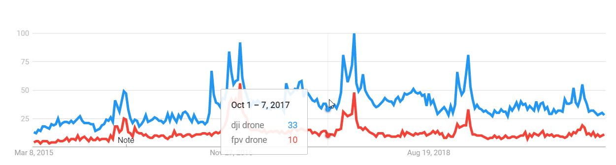 dji drone vs. fpv drone - what’s been more popular?
In this viz, the trend lines clearly stand out, but the actual numbers take a back seat. Until you roll over the graph. A nice tooltip pops up and gives you precise metrics for the spot where you’re hovering, allowing you to interact and drill down without getting overloaded.
Of particular note is the formatting of the tooltip information - clear distinctions between the date range and the underlying data, and color coding to visually match the data points to their trend lines.
The Exercise
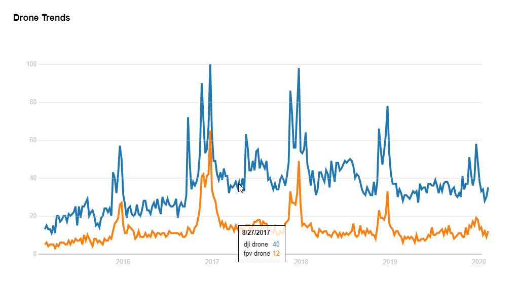
For our version of this viz, we’ve simplified it a little. The Trends interaction has a sliding vertical line and data points that appear on rollover, but we’re focusing just on the tooltip window itself.
There are many good examples of D3 tooltips online, particularly Bostock’s example here. Even the “simple” ones, though, tend to be complex, and if you’ve never created one of these before I encourage you to keep it as simple as possible. For example, you may want to create the basic structure of the tooltip in HTML, rather than building it dynamically.
<div id="tooltip" class="hidden">
    <div id="tt-date"></div>
    <div id="tt-data">
        <table>
        </table>
    </div>
</div>
Then you can add and modify the elements with D3 as needed. If you can, try to incorporate the color and layout elements of the Trends tooltip.
If you’re following along with the inspiration graph, the data can be downloaded from the Google Trends page. For convenience I’ve placed it in this gist as well.
For a head start, you can use the code below to lay the groundwork with everything but the tooltip.
// set margins by convention
const margin = {top: 50, right: 80, bottom: 70, left: 50},
      width = 700,
      height = 300;

const URL = "https://gist.githubusercontent.com/fraziern/95fc8cfce299accd608928caf65f134f/raw/42095ee60cf540b78b37fc33017d03632af9f77d/trendsdata.csv";

const svg = d3.select(".chart")
  .append("svg")
  .attr("width", width + margin.left + margin.right)
  .attr("height", height + margin.top + margin.bottom);

const chart = svg
  .append("g")
  .attr("transform", `translate(${margin.left},${margin.top})`);

const tooltip = d3
  .select('#tooltip');

// initialize the ranges
const x = d3.scaleUtc()
  .range([0, width])
  .clamp(true);  // prevent rollover OB errors

const y = d3.scaleLinear()
  .domain([0, 100])
  .range([height, 0]);

function createChart(rawData) {

  // data wrangling
  const categories = d3.keys(rawData[0]).filter(d => d !== "Week" && d !== "date");
  const data = categories.map(c => ({
    category: c,
    values: rawData.map(d => ({
      date: d.date,
      value: d[c]
    }))
  }));

  x.domain(d3.extent(data[0].values, d => d.date));

  // add axes
  let yAxisGenerator = d3.axisLeft(y).tickSize(-width).ticks(5);
  svg.append('g')
    .attr("class", "axis yaxis")
    .attr("transform", `translate(${margin.left - 10},${margin.top})`)
    .call(yAxisGenerator);

  let xAxisGenerator = d3.axisBottom(x);
  svg.append('g')
    .attr("class", "axis xaxis")
    .attr("transform", `translate(${margin.left},${margin.top + height})`)
    .call(xAxisGenerator);

  // colors
  const color = d3.scaleOrdinal(d3.schemeCategory10)
    .domain(categories);

  const valueline = d3.line()
    .x(d => x(d.date))
    .y(d => y(d.value));

  // Add the paths.
  const name = chart.selectAll(".name")
      .data(data)
    .join("g")
      .attr("class", "name");

  name.append("path")
      .attr("class", "line")
      .attr("d", d => valueline(d.values))
      .style("stroke", d => color(d.category));

  // rollover implementation
  // COMPLETE THE EXERCISE HERE

  svg.on("touchmove mousemove", mousemove);
  svg.on("touchend mouseleave", mouseout);
}

d3.csv(URL, d3.autoType)
  .then(function (data) {
    data.forEach(el => {
      el.date = new Date(el.Week)
    });
    return data;
})
  .then(createChart);
A Solution
My solution looks like this:
The tooltip implementation code is below. One nice trick that this incorporates is the use of the D3 bisector function generator to help map the mouse position to the data. Several online tooltip examples use it like so:
- Get the mouse X position
- Use
x.invertto convert the position to a date - Use
bisectorto find the spot in the sorted data array where this date would fall - Further refine the selection by finding the array element that’s mathematically closest to the date
Given the close packing of the data in this solution, the last step isn’t really necessary and has been removed to keep it simpler.
For more, refer to the documentation on bisector.
The solution code is below, but as always you’re encouraged to try writing it yourself before peeking. The complete code (with HTML and CSS) is available on codepen.
const bisectDate = d3.bisector(d => d.date).left;

function mousemove() {
    // get date corresponding to mouse x position
    const date = x.invert(d3.mouse(this)[0]);

    // get data
    const index = bisectDate(rawData, date, 1);
    // document.querySelector(".debug").innerText = JSON.stringify(index);
    const datapoint = rawData[index];

    // display date
    d3.select('#tt-date').text(datapoint.Week);

    // add rollover data rows, clearing old ones first
    ttrows.selectAll('td').remove();

    ttrows.each(function (d) {
        d3.select(this).append('td').text(d);
        d3.select(this).append('td').text(datapoint[d])
        .style("color", d => color(d));
    });

    // display rollover
    d3.select('#tooltip')
        .style("left", x(datapoint.date) + "px")
        .style("top", width/2 + "px")
        .classed('hidden', false);
}

function mouseout() {
    d3.select('#tooltip')
        .classed('hidden', true);
}