Bar Graph with Text Ticks
The Inspiration
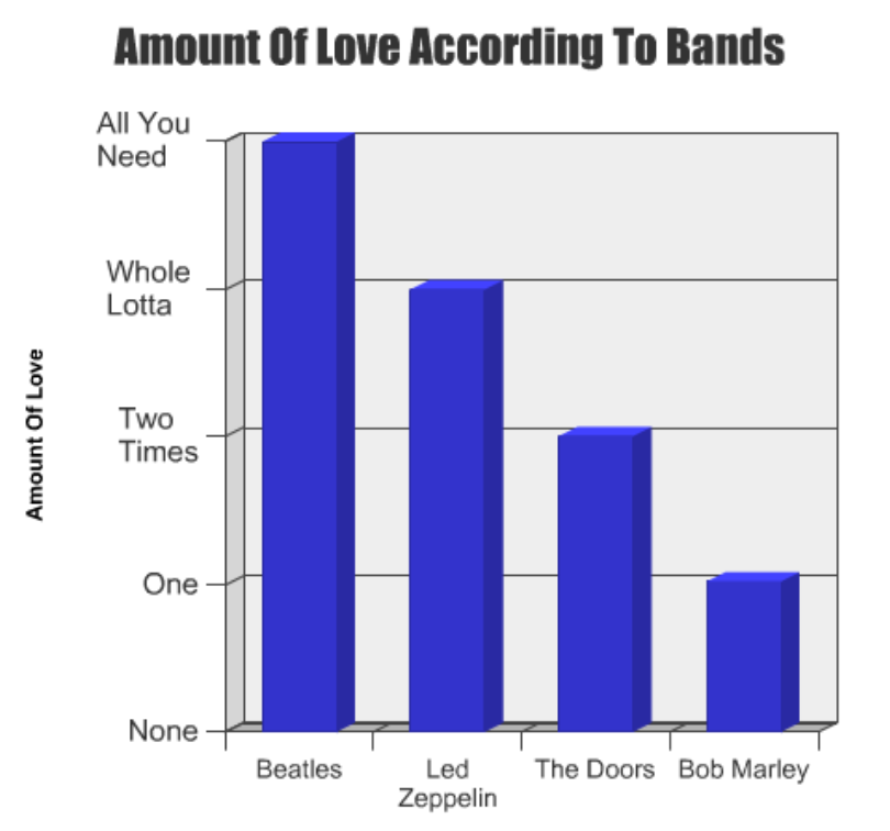
This exercise is to build a deceptively simple bar graph. The inspiration comes from the clever “Amount of Love According To Bands” by mattmattmatt on GraphJam. Note the word wrap and the use of text-based axes.
The Exercise
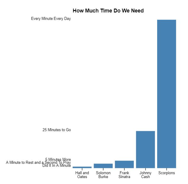
My version is called “How Much Time Do We Need.” (The second bar isn’t exactly to scale… but I needed to make room on the Y-axis for all the labels so I fudged a bit.)
Most of the steps involved in building this visualization should be familiar to you if you’ve got a little experience creating D3 bar graphs. But there are a few challenges particular to this one:
- Setting the y-axis scale correctly, since you have numeric data with text labels
- Adding the y axis itself
- Managing some word wrap (definitely the hardest part)
The complete data is below (JSON format). To make things easier for setting up a quick word wrap routine, I added a / where a line break should go, in the X-axis labels.
[
  ["Hall and/Oates","Did It In A Minute",1],
  ["Solomon/Burke","A Minute to Rest and a Second To Pray", 3],
  ["Frank/Sinatra","5 Minutes More",5],
  ["Johnny/Cash","25 Minutes to Go",25],
  ["Scorpions","Every Minute Every Day",100]
]
A Solution
To accomplish the word wrap, I borrowed heavily from Mike Bostock’s technique here. Since we already have line break delimiters in the data, we can simplify Bostock’s code quite a bit.
My solution is below, but I encourage you to attempt it first without peeking. The full code and working example can be found on codepen.
const x_labels = data_raw.map(e=>e[0]);
const y_labels = data_raw.map(e=>e[1]);
const data = data_raw.map(e=>e[2]);

// set margins by convention
var margin = {top: 70, right: 20, bottom: 30, left: 200},
    width = 500 - margin.left - margin.right,
    height = 500 - margin.top - margin.bottom;

var chart = d3.select(".chart")
    .attr("width", width + margin.left + margin.right)
    .attr("height", height + margin.top + margin.bottom)
  .append("g")
    .attr('transform', `translate(${margin.left}, ${margin.top})`);

var maxValue = d3.max(data);

var y = d3.scaleLinear()
    .range([height, 0])
    .domain([0, maxValue]);

var x = d3.scaleBand()
    .paddingInner(.1)
    .rangeRound([0, width])
    .domain(x_labels);

 chart.append("text")
      .attr("class", "title")
      .attr("x", 0)
      .attr("y", -20)
      .text("How Much Time Do We Need");

var barContainer = chart.append("g")
  .attr("class","bar-container");

var bar = barContainer.selectAll("g")
    .data(data)
  .enter().append("g")
    .attr("transform", (d, i) => `translate($(x(x_labels[i])),0)`);

bar.append("rect")
    .attr("width", x.bandwidth)
    .attr("height", (d) => height - y(d))
    .attr("y", y);

chart.append("g")
    .attr("class", "x axis")
    .attr("transform", `translate(0,$(height))`)
    .call(d3.axisBottom(x))
    .selectAll(".tick text")
      .call(wrap, x.bandwidth());

var yAxisContainer = chart.append("g")
  .attr("class","yaxis-container");

var yAxis = yAxisContainer.selectAll("g")
  .data(data)
  .enter().append("g")
  .attr("transform", (d, i) => `translate(-5,$(y(d)))`);

yAxis.append("text")
  .text((d,i)=>y_labels[i])
  .attr("text-anchor","end");

// wrap function inspired by Mike Bostock
// https://bl.ocks.org/mbostock/7555321

function wrap(text, width) {
  text.each(function() {
    var text = d3.select(this),
        lines = text.text().split(/\//),
        lineHeight = 1.1, // ems
        y = text.attr("y"),
        dy = parseFloat(text.attr("dy"));
    text.text(null);
    lines.forEach(function(l,i){
        text.append("tspan")
          .attr("x", 0)
          .attr("y", y)
          .attr("dy", i * lineHeight + dy + "em")
          .text(lines[i]);
    });
  })
}