Stacked Bar Chart
The Inspiration
The inspiration for this exercise was the stacked bar chart showing Democratic primary candidate endorsements on Fivethirtyeight.com
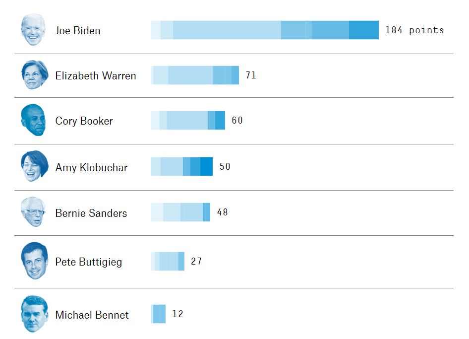
I like this chart a lot. It’s intuitive, clear, gets the big picture across at a glance, but allows for drilling down into the details as well. Also, floating heads are always hilarious.
The Exercise
Stacked bar charts (and similar things like streamgraphs) can be a bit of a challenge. The D3.js API for stacks took me some time to wrap my head around. But it’s definitely doable.
In addition to the official D3.js documentation on stacks, I found Bostock’s Tidy Stacked Area Chart example helpful as well.
For this exercise, we’ll use some data I generated on high calorie foods. Each food has a breakdown of macronutrients, and the chart should show total calories as well. The data can be found here.
I lifted the color pallette directly from the inspiration chart. Hey, it’s a great pallette.
A Solution
My solution looks like this:
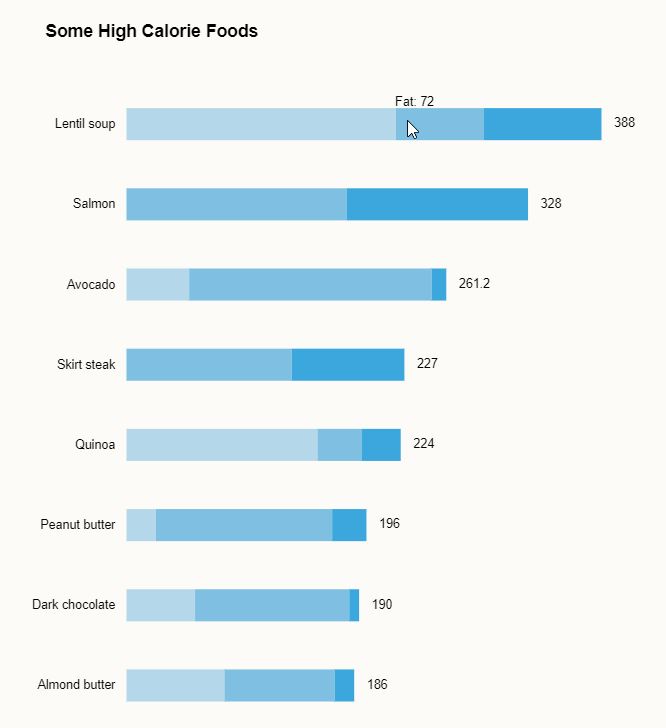
Lentil soup - the next avocado?
The code is below, but I encourage you to try your hand at this exercise on your own. Complete code and working example (with tooltip rollovers for the stacks) can be found on codepen.
// Initial setup / set margins by convention
const margin = {top: 0, right: 30, bottom: 20, left: 90},
    width = 500 - margin.left - margin.right,
    height = 700 - margin.top - margin.bottom,
    svg = d3.select(".chart")
      .append("svg")
        .attr("width", width + margin.left + margin.right)
        .attr("height", height + margin.top + margin.bottom);

var chart = svg.append("g")
  .attr('transform', `translate(${margin.left}, ${margin.top})`);

const URL = "https://gist.githubusercontent.com/fraziern/084ab4f8535083ebf90ada173faae054/raw/19f44640f4f193850a1392305a1824e922214d40/foodcalories.csv";

function createChart(data) {
  var stack = d3.stack()
    .keys(["Carbs", "Fat", "Protein"])
    .order(d3.stackOrderNone);

  var series = stack(data);

  const xMax = d3.max(series, y => d3.max(y, d => d[1]));

  var x = d3.scaleLinear()
    .domain([0, xMax])
    .range([0, width]);

  var y = d3.scaleBand()
    .domain(data.map(d => d.Food))
    .range([0, height])
    .padding(0.6);

  color = d3.scaleOrdinal()
    .domain(series.map(d => d.key))
    .range(d3.quantize(d3.interpolateHcl("#B4D8E9", "#3CA7DC"), series.length));

  chart.append("g")
    .selectAll("g")
    .data(series)
    .join("g")
      .attr("fill", d => color(d.key))
    .selectAll("rect")
    .data(d => d)
    .join("rect")
      .attr("y", (d, i) => y(d.data.Food))
      .attr("x", d => x(d[0]))
      .attr("width", d => x(d[1]) - x(d[0]))
      .attr("height", y.bandwidth())
      .on("mouseout", () => tooltip.style("display", "none"))
      .on("mouseover", displayTooltip);

  // y axis
  yAxis = g => g
    .call(d3.axisLeft(y));

  chart.append("g")
      .call(yAxis);

  // data labels
  chart.append("g")
    .selectAll(".data-label")
    .data(data)
    .join("text")
      .attr("class", "data-label")
      .text(d => d.Total)
      .attr("y", d => y(d.Food))
      .attr("x", d => x(d.Total))
      .attr("dy", y.bandwidth() / 2)
      .attr("dx", "1em")
      .attr("alignment-baseline", "middle");

  // tooltip
  var tooltip = chart.append("g")
    .attr("class", "tooltip")
    .style("display", "none");

  tooltip.append("text")
    .attr("x", 15)
    .attr("dy", "-0.2em")
    .style("text-anchor", "middle");

  function displayTooltip(d, i) {
    var thisName = d3.select(this.parentNode).datum().key;
    var thisValue = d.data[thisName];
    var xPosition = x(d[0]);
    var yPosition = y(d.data.Food);
    tooltip.attr("transform", "translate(" + xPosition + "," + yPosition + ")");
    tooltip.select("text").text(thisName + ": " + thisValue)
    tooltip.style("display", null);
  }
}

d3.csv(URL,
  (d, i, columns) => (
    d3.autoType(d),
    d.Total = d3.sum(columns, c => d[c]),     d))
  .then(d => d.sort((a, b) => b.Total - a.Total))
  .then(d => d.slice(0,10))
  .then(createChart);