Compound Scatter/Bar Graph
The Inspiration
For this exercise, I took inspiration from Philippe “Fil” Rivière’s take on climate change in Minneapolis on Observable.
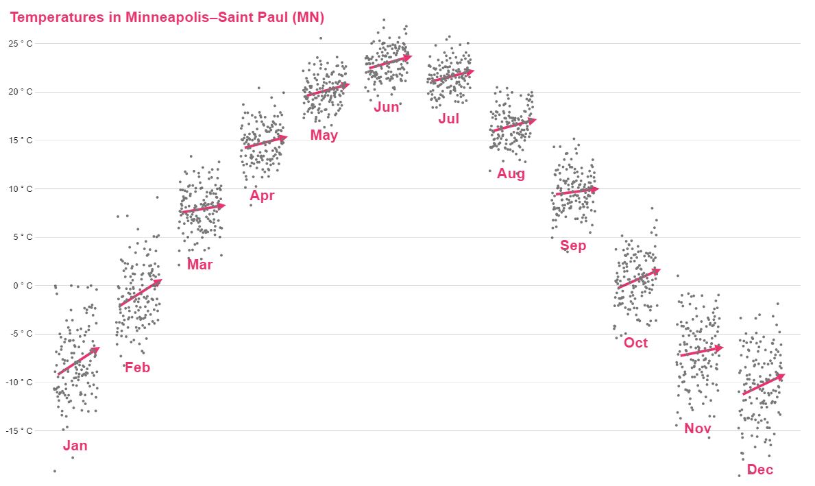
I liked how Fil’s viz makes use of small multiples to combine two types of graphs. The trend lines are of course a key feature of his data story, but they introduce more complexity into the code than I wanted for this quick exercise.
The Exercise
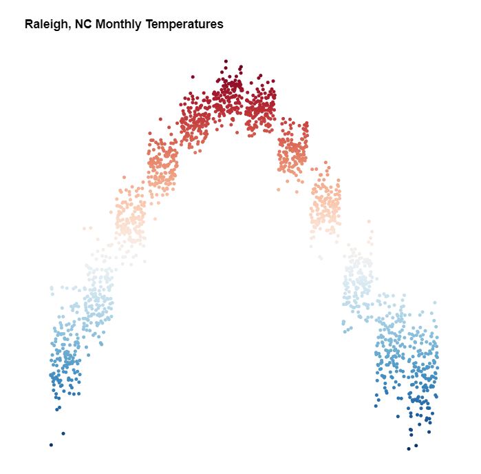
Simplifying things a bit, this exercise focuses on accomplishing the basics: using monthly temperatures over a span of years, graph scatter plots by month and combine them.
For this exercise, I wanted to use data from my hometown instead of Minneapolis. I was able to find historical monthly temperatures for Raleigh, and used Python to scrape and munge the data into something usable.
If you’re interested, here’s the Python scraping code.
import requests
from bs4 import BeautifulSoup

page = requests.get("https://sercc.com/cgi-bin/sercc/cliMONtavt.pl?nc7079")
soup = BeautifulSoup(page.content, 'html.parser')

table = soup.find('table')
rows = table.find_all('tr')
data = []

for row in rows:
    cols = row.find_all('td')
    cols = [ele.text.strip() for ele in cols]
    if len(cols) > 14:
        cols = [cols[0]] + cols[1::2]
    data.append(cols)

data = data[:93] # truncate the summary statistics
A Solution
My solution to this exercise looks like this:
A key technique for this is to calculate the x coordinates for each dot by combining 2 scales, e.g.:
let x = date =>
    xMonth(date.getMonth()) + xYear(date.getFullYear());
My solution is below, but I encourage you to attempt it first without peeking. The full code and working example can be found on codepen. The temperature data is here.
d3.csv( "https://gist.githubusercontent.com/Fil/15e57d2584b618521d173d4c0088d13b/raw/2f7f1a236c074635435cc7ebf9253c20a5681690/data.csv",
({date, temp}) => ({date: new Date(date), temp: +temp})
).then(d => d.filter(el=>el.temp))
.then(createChart);

function createChart(d) {
  // set margins by convention
  const margin = {top: 20, right: 20, bottom: 30, left: 30},
      width = 500 - margin.left - margin.right,
      height = 500 - margin.top - margin.bottom;

  var chart = d3.select(".chart")
    .append("svg")
      .attr("width", width + margin.left + margin.right)
      .attr("height", height + margin.top + margin.bottom)
    .append("g")
      .attr('transform', `translate(${margin.left}, ${margin.top})`);

  let years = d.map(el=>el.date.getFullYear()),
      temps = d.map(el=>el.temp);

  let xMonth = d3.scaleBand()
    .domain(d3.range(12))
    .range([0, width])
    .paddingInner(0.1);

  let xYear = d3.scaleLinear()
    .domain([d3.min(years), d3.max(years)])
    .range([0, xMonth.bandwidth()]);

  let x = date =>
    xMonth(date.getMonth()) + xYear(date.getFullYear());

  let y = d3.scaleLinear()
    .domain([d3.min(temps), d3.max(temps)])
    .range([height, 0]);

  let colors = d3.scaleSequential(d3.interpolateRdBu)
  .domain([d3.max(temps), d3.min(temps)]);

  chart.selectAll("circle")
    .data(d)
    .enter()
    .append("circle")
    .attr("class", "circle")
    .attr("r", 2.0)
    .attr("fill", d => colors(d.temp))
    .attr("cx", d => x(d.date))
    .attr("cy", d => y(d.temp));
}