Slopegraph pt.2: Improved with Data Points
In the first slopegraph exercise, I created this visualization of top 10 female baby names.
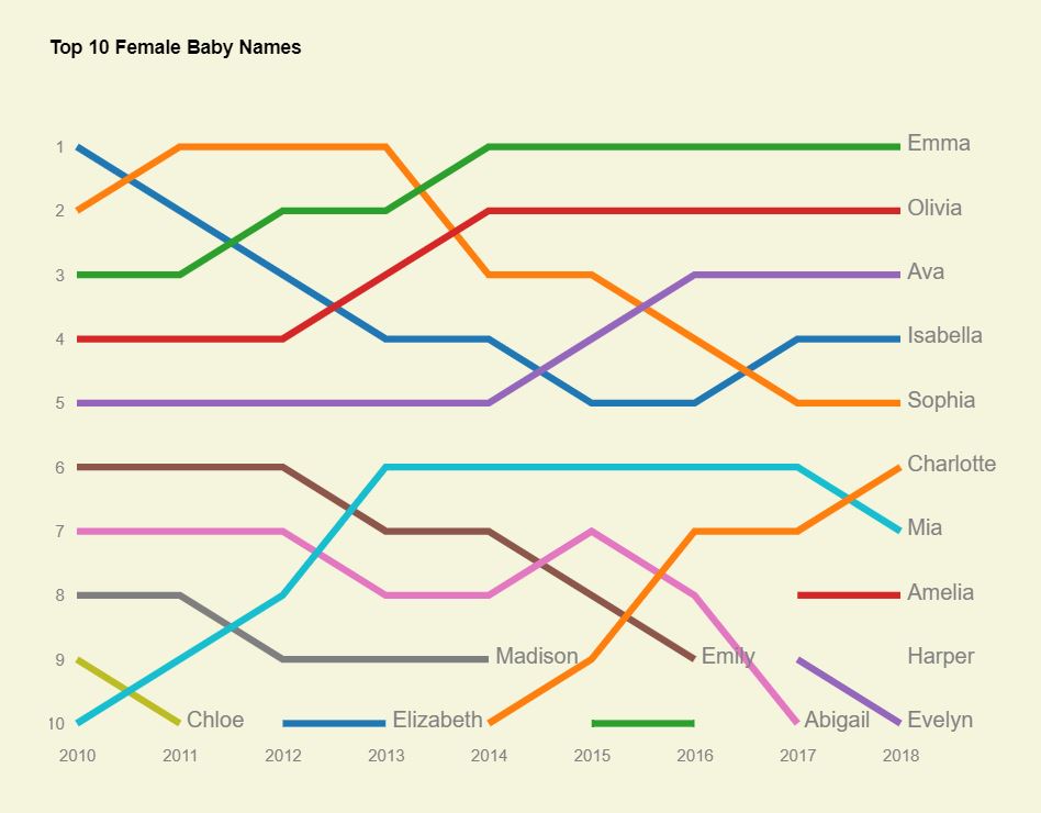
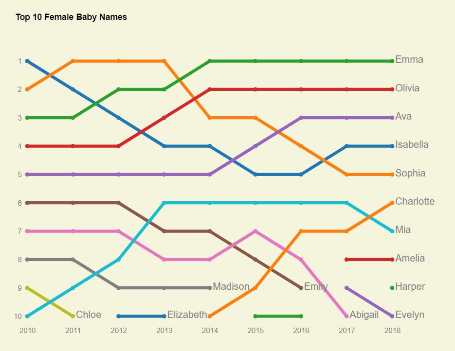
In sticking with my aim to keep the exercises short and quick, I left both a substantive issue and a style issue for a follow-up exercise. Substantively - the “Harper” point isn’t shown for 2018, because we don’t have data points added. That will be our first task in this exercise.
Scatterplots and Accessing Parent Data
The idea is to overlay a scatterplot on top of the existing plot, which will add a point for Harper/2018, and will also make the data points clearer for the rest of the graph. I found some example code from Max Goldstein here for doing something like this, which got me part of the way.
A key challenge with this is to keep track of what color each point should be. This requires accessing the data bound to the parent group object. Max solves it using “a little known third argument j” to index the group.
city.selectAll("circle")
    .data(function(d){return d.values})
    .enter()
    .append("circle")
    .attr("r", 3)
    .attr("cx", function(d) { return x(d.date); })
    .attr("cy", function(d) { return y(d.temperature); })
    .style("fill", function(d,i,j) { return color(cities[j].name); });
However, this code is based on D3 v.3. In D3 v.4 the “j” was removed. See Bostock’s discussion about indexing parent groups on github.
Most modern solutions to this I’ve seen involve complex workarounds. Some of these involve selection.each. As Bostock describes it on github: “…you can use selection.each and create a closure that exposes parent and child data simultaneously. “
But there is another option mentioned almost in passing, which I think is elegant in its simplicity and works well here: “You can push that parent data down into the child data, replicating it for each child.”
This is what I’ve done here.
Thus,
  let data = names.map(name => {
    let arr = rawData.map(d => ({Year: d.Year, Rank: d[name]}));
    return {Name: name, Data: arr};
  })
becomes
  let data = names.map(name => {
    let arr = rawData.map(d => ({Year: d.Year, Rank: d[name], Name: name}));
    return {Name: name, Data: arr};
  })
By tacking on the parent name to each data point during the data munging step, you no longer need to try and figure out how to access the parent later. The number of data points here is small too, so there’s not really a memory or performance issue with doing so.
Once you have the parent name, you can easily get the color information.
forEach vs. .data(data)
The second, perhaps less difficult, problem I wanted to solve is stylistic. My prior code makes use of “forEach” instead of the more idiomatic D3 data-bind. This is a fairly straightforward fix.
Old code:
  data.forEach(name => {
    chart.append("path")
      .attr("class", "line")
      .attr("d", valueline(name.Data))
      .attr("stroke", colors(name.Name));
  });
New code:
  var name = chart.selectAll(".name")
      .data(data)
    .join("g")
      .attr("class", "name");

  name.append("path")
      .attr("class", "line")
      .attr("d", d => valueline(d.Data))
      .style("stroke", d => color(d.Name));
The resulting graph looks like this.
The complete HTML/CSS/JS code and working example are on codepen.
The baby name data I used is here.