Pictogram (Part 1)
The Inspiration
Pie charts are not well-liked. For years, the data designers have railed against them and their problems with obfuscation, misdirection, and general bad looks.
But people still use pie charts, and the reason is that pie charts are a way to concisely represent “percentages that add up to a whole.” Fortunately, though, there are other ways to do this too - ways that are more palatable and easier to read.
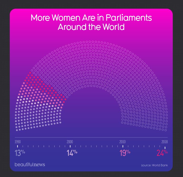
The inspiration for this exercise is one of those ways. In the graph More Women Are in Parliaments Around the World, the graph smartly represents not just percentages of a whole, but a progression of percentages. It can be thought of as a layered, squarish pie chart. And the design is a perfect way to practice pictograms.
Pictograms, or pictographs, are a way to show numbers of things using repeated images. These can often be found in the pages of national newspapers, and are often a bit whimsical.
source: https://www.forbes.com/sites/naomirobbins/2012/10/10/two-opinions-on-the-usefulness-of-pictographs/#91aed7223dd8
Here, instead of representational images (e.g. apples) the designer has used more abstract icons, empty or colored, and in the shape of a parliamentary seating chart.
The Exercise
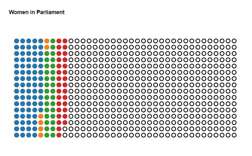
For this exercise, we’ll simplify the inspiration viz quite a bit to boil it down to the essential feature - repeating filled and unfilled circles, with colors representing percentages.
It’s recommended that, to keep it simple, you build a rectangle made of SVG circles, then color them in according to percentages. Don’t worry about the axis for now - we’ll tackle that in a follow-up exercise.
The complete data used for my solution is below.
[
  {year: 1990, pct: 13},
  {year: 2000, pct: 14},
  {year: 2010, pct: 19},
  {year: 2018, pct: 24}]
A Solution
My solution looks like this:
The code is below, but I encourage you to try your hand at this exercise on your own. Complete code and working example can be found on codepen.
And once you’ve completed this step, I encourage you to check out Part 2, where we add a fancy axis.
let r = 5, rows = 16, columns = 37, pointTotal = rows * columns;

// set margins by convention
const margin = {top: 50, right: 80, bottom: 70, left: 20},
      width = (columns * r * 3),
      height = (rows * r * 3);

var svg = d3.select(".chart")
  .append("svg")
  .attr("width", width + margin.left + margin.right)
  .attr("height", height + margin.top + margin.bottom);

var chart = svg
  .append("g")
  .attr("transform", `translate(${margin.left},${margin.top})`);

// set the ranges
var x = d3.scalePoint()
  .domain(d3.range(columns))
  .range([0, width]);
var y = d3.scalePoint()
  .domain(d3.range(rows))
  .range([0, height]);

function createChart(data) {

  // calculate number of circles needed for each pct
  function getCircleCount(pct) {
    return Math.floor(pct / 100 * pointTotal);
  }

  // for convenience, separate out the component data values
  let pcts = data.map(d => d.pct);
  let years = data.map(d => d.year);

  // set up colors
  var color = d3.scaleOrdinal(d3.schemeCategory10)
    .domain(pcts);

  // create grid
  function addCircles(pct, stroke, fill) {
    chart.append("g")
        .attr("class", "set_" + pct)
      .selectAll("circle")
        .data(d3.range(getCircleCount(pct)))
        .join("circle")
        .attr("class", "circle")
        .attr("cx", d => x(Math.floor(d / rows)))
        .attr("cy", d => y(d % rows))
        .attr("stroke", stroke)
        .attr("fill", fill)
        .attr("r", r);
  }

  // draw black circles, then circles for each pct
  addCircles(pointTotal, "black", "none");
  pcts.slice().reverse().forEach(d => addCircles(d, color(d), color(d)));
}

// percentages x 100 in 4 years
let rawData = [
  {year: 1990, pct: 13},
  {year: 2000, pct: 14},
  {year: 2010, pct: 19},
  {year: 2018, pct: 24}];

createChart(rawData);