Pictogram (Part 2)
This exercise is a quick extension of the last one, where we built a simple pictogram based on the below inspiration.
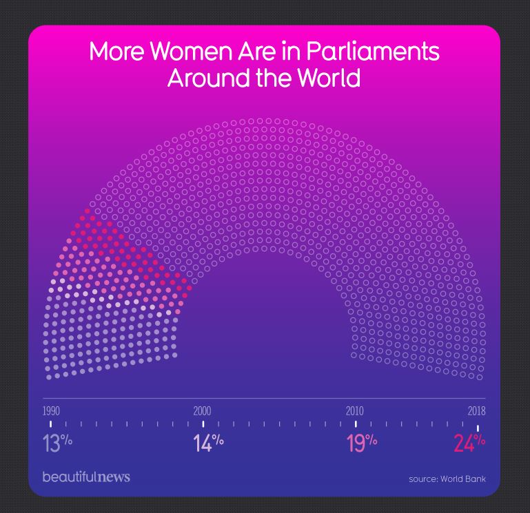
Check out Part 1 if you haven’t yet, then come back!
The Exercise
For this exercise, we’ll enhance the basic pictogram by adding an axis at the bottom that visually explains what the dots and circles mean.
This will be one of the quicker exercises here - the main challenge with this piece is to create what is essentially two axes combined: one for years, and one for percentages. It’s important to note that the main ticks aren’t completely evenly spaced. There’s one minor tick for each year, and one major tick for each data point. Three of the four data points fall at a decade mark, but one doesn’t.
A Solution
My solution looks like this:
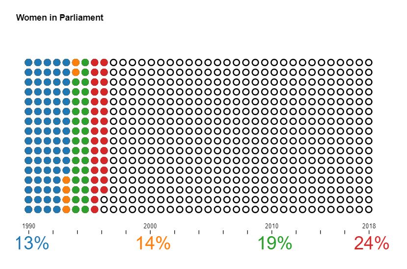
The code is below, but as always I encourage you to try your hand at this exercise on your own. Complete code and working example can be found on codepen.
let r = 5, rows = 16, columns = 37, pointTotal = rows * columns;

// set margins by convention
const margin = {top: 50, right: 80, bottom: 70, left: 20},
      width = (columns * r * 3),
      height = (rows * r * 3);

var svg = d3.select(".chart")
  .append("svg")
  .attr("width", width + margin.left + margin.right)
  .attr("height", height + margin.top + margin.bottom);

var chart = svg
  .append("g")
  .attr("transform", `translate(${margin.left},${margin.top})`);

// set the ranges
var x = d3.scalePoint()
  .domain(d3.range(columns))
  .range([0, width]);
var y = d3.scalePoint()
  .domain(d3.range(rows))
  .range([0, height]);

function createChart(data) {

  // calculate number of circles needed for each pct
  function getCircleCount(pct) {
    return Math.floor(pct / 100 * pointTotal);
  }

  // for convenience, separate out the component data values
  let pcts = data.map(d => d.pct);
  let years = data.map(d => d.year);

  // set up colors
  var color = d3.scaleOrdinal(d3.schemeCategory10)
    .domain(pcts);

  // create grid
  function addCircles(pct, stroke, fill) {
    chart.append("g")
        .attr("class", "set_" + pct)
      .selectAll("circle")
        .data(d3.range(getCircleCount(pct)))
        .join("circle")
        .attr("class", "circle")
        .attr("cx", d => x(Math.floor(d / rows)))
        .attr("cy", d => y(d % rows))
        .attr("stroke", stroke)
        .attr("fill", fill)
        .attr("r", r);
  }

  // draw black circles, then circles for each pct
  addCircles(pointTotal, "black", "none");
  pcts.slice().reverse().forEach(d => addCircles(d, color(d), color(d)));

  // add axis
  let axisScale = d3.scaleLinear()
    .domain(d3.extent(years))
    .range([0, width]);

  let axisGeneratorTop = d3.axisTop(axisScale)
  .tickFormat(d => years.includes(d) ? d : "");

  let axis = svg.append("g")
    .attr("class", "axis")
    .attr("transform", `translate(${margin.left},${margin.top + height + 40})`)
    .call(axisGeneratorTop);

  // add pcts
  svg.append("g")
      .attr("transform", `translate(${margin.left},${margin.top + height + 65})`)
      .attr("class", "pcts")
    .selectAll("text")
      .data(data)
      .join("text")
      .attr("x", d => axisScale(d.year))
      .attr("dx", 5)
      .text(d => d.pct + "%")
      .attr("fill", d => color(d.pct));

  // styling
  axis.select(".domain").remove();

  // document.querySelector(".debug").innerText = JSON.stringify(data);
}

// percentages x 100 in 4 years
let rawData = [
  {year: 1990, pct: 13},
  {year: 2000, pct: 14},
  {year: 2010, pct: 19},
  {year: 2018, pct: 24}];

createChart(rawData);