A Streamgraph
The Inspiration
A “streamgraph” is a stacked area graph centered along a horizontal axis (generally a timeline), giving it a flowy, streamy feel. And compared to the more traditional stacked columns, it can be easier to compare across categories.
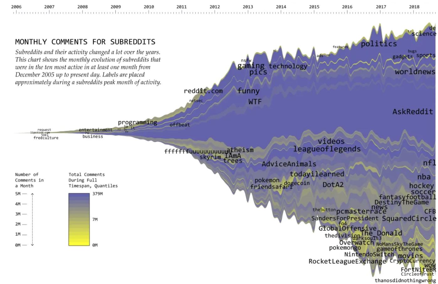
In this exercise we’ll crete a streamgraph, taking inspiration from a graph of subreddit comments by Nathan Yau on Flowing Data.
The Exercise
It may be helpful to try your hand at a stacked bar chart first, if you haven’t done one already.
I encourage you to carefully digest the documentation on stacks, and sort through a few examples. I particularly like these:
Also helpful is this page on D3 color schemes. I think it’s important to get color right on these.
For the data, instead of using reddit comment data I pulled from Stack Exchange - in particular, trends in questions that had data-visualization-related tags. This seemed like a fun way to roughly gauge popularity of some different tools in the space.
Along the way I discovered the Stack Exchange data repository, which is an amazing site that actually lets you write and run SQL queries against its dataset, right there on the page. In addition, you can search other users’ queries and fork them to jumpstart your own.
Which is exactly what I did to get the data for this exercise. You can find my query here.
A Solution
My solution is shown below. As usual I simplified things a bit, since it’s designed to be an exercise only, but tried to keep the essential features.
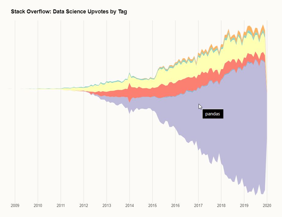 Pandas is kinda getting huge
The Stack Exchange data can be found here.
My code for the solution is below. I encourage you to get hands-on with making your own version (using the provided data or your own) as an exercise.
// Initial setup / set margins by convention
const margin = {top: 0, right: 30, bottom: 20, left: 90},
    width = 800 - margin.left - margin.right,
    height = 500 - margin.top - margin.bottom,
    svg = d3.select(".chart")
      .append("svg")
        .attr("width", width + margin.left + margin.right)
        .attr("height", height + margin.top + margin.bottom)
        .attr("transform", `translate(${margin.left},${margin.top})`);

const URL = "https://gist.githubusercontent.com/fraziern/ec2c086c14dbeb33d60a30eeda0925f8/raw/83abce5004e9e23a02480fb2eeac98163ec2640c/stack_overflow_upvotes-by-tag.csv";

function createChart(data) {

  var keys = Array.from(d3.group(data, d => d.key).keys());

  function reduceValues(v) {
    return d3.sum(v, d => d.value)
  }

  // For an explanation as to why the date should be converted to a number, see Key Equality in
  // https://observablehq.com/@d3/d3-group
  var values = Array.from(d3.rollup(
    data,
    reduceValues,
    d => +d.month,
    d => d.key
  ));

  function getValue(d, key) {
    let value = d[1].get(key);
    return value === undefined ? 0 : value;
  }

  var stackGenerator = d3.stack()
    .keys(keys)
    .value(getValue)
    .offset(d3.stackOffsetWiggle)
    .order(d3.stackOrderInsideOut);

  var series = stackGenerator(values);

  let x = d3.scaleUtc()
    .domain(d3.extent(data, d => d.month))
    .range([0, width]);

  function xAxis(g) {
    g
    .attr("class", "grid")
    .attr("transform", `translate(0,${height})`)
    .call(d3.axisBottom(x).tickSize(-height))
  }

  let maxSeriesY = d3.max(series, d => d3.max(d, d => d[1])),
    minSeriesY = d3.min(series, d => d3.min(d, d => d[0]));

  let y = d3.scaleLinear()
    .domain([minSeriesY, maxSeriesY]).nice()
    .range([height, 0]);

  let color = d3.scaleOrdinal()
    .domain(keys)
    .range(d3.schemeSet3);

  let area = d3.area()
    .x(d => x(d.data[0]))
    .y0(d => y(d[0]))
    .y1(d => y(d[1]));

  svg.append("g")
      .call(xAxis);

  svg.append("g")
    .selectAll("path")
    .data(series)
    .join("path")
      .attr("fill", ({key}) => color(key))
      .attr("d", area)
    .append("title")
      .text(({key}) => key);
}

d3.csv(URL, ({Month, TagName, Upvotes}) => ({
  month: new Date(Month),
  key: TagName,
  value: +Upvotes
}))
  .then(createChart);
Complete code and working example can be found at codepen.